User Guide
On this page:
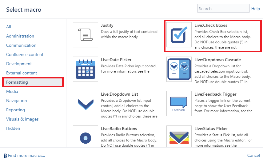
- Live:Check Boxes
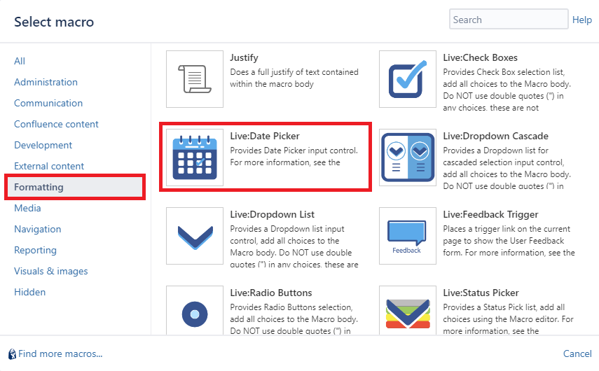
- Live:Date Picker
- Live:Dropdown Cascade
- Live:Dropdown List
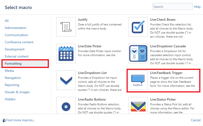
- Live:Feedback Trigger
- Live:Radio Buttons
- Live:Status Picker
- Live:Table
- Live:Text Area
- Live:Text Input
- Limitations
- Programming Interfaces
Live:Check Boxes
This macro displays a set of checkboxes for users to select. The selections are done live (without editing the Confluence page).
Users simply click on the checkboxes to select or deselect choices.
Changes are stored on the Confluence Server.
Macro Parameters
If set then data is not stored on the server. Useful when creating interactive forms or automation. The default behaviour is to save changes.
| Parameter | Required | Description |
|---|---|---|
| Title | Optional | If provided, places input control in a form with the specified Title. |
| Title Width | Optional | Specify the width of the Title area in pixels. |
| Red outline when empty | Optional | Add a red outline to the input when the field is empty. |
| Vertical | Optional | Select whether to display the choices in a vertical or horizontal row, the default is Vertical. |
| Width | Optional | Specify the width of the individual choices. Useful when Horizontal selected to layout the choices into a grid. |
| Page Variable | Optional | Use this to add Page Variables, when added, then the variable substitution will be carried out on the page. Use %PageVariable anywhere on the page to substitute the selected value. Use Page Variables for programming using remote API access and JavaScript access. Refer to Page Variable Substitution |
| Send Email | Optional | Check this if an email notification is to be sent to Page watches when changed. The default is disabled. |
| Don’t Save | Optional | If set then data is not stored on the server. Useful when creating interactive forms or automation. The default behaviour is to save changes. |
Macro Body
The body must contain one or more choices that will be displayed on the page for this set of Checkboxes.
Each line of text in the Macro body will describe a single check box choice. For nested checkboxes (up to one level deep), indent the line using tabs or spaces, to indicate children checkboxes.
The body can contain name and value pairs. This allows for the name to be displayed on the screen to users and the value used and stored internally and for substitution values. See the examples below.
Examples
- This is a typical body, which has a list of names to use for the choices
Version 1
Version 2
Version 3
- This is a body that provides separate data for display names and internal values, note the data is separated using the ‘|’ character. Lines can optionally have the value, it is not required if some values have the same display name and value
Version 1 | 0012989-1
Version 2 | 0012989-2
Version 3
Version 4 | ver 4.0
In this case, the Versions are displayed, but the value is stored internally and used in substitutions on the page.
- Nested checkboxes, provide one level of nesting, parent and children. These are defined using indentation. Piping ‘|’ is also supported.
Parent 1
	Child 1
	Child 2
Parent 2
	Child 3
	Child 4
Live:Date Picker
This macro displays a Date on the page. Users can set/modify the Date live (without editing the Confluence page).
Users click on the Date, and a pop-up date form is displayed for the user.
Changes are stored on the Confluence Server.
Macro Parameters
| Parameter | Required | Description |
|---|---|---|
| Title | Optional | If provided, places input control in a form with the specified Title |
| Title Width | Optional | Specify the width of the Title area in pixels. |
| Red outline when empty | Optional | Add a red outline to the input when the field is empty. |
| Page Variable | Optional | Use this to add Page Variables, when added, then the variable substitution will be carried out on the page. Use %PageVariable anywhere on the page to substitute the selected value. Use Page Variables for programming using remote API access and JavaScript access. Refer to Page Variable Substitution |
| Send Email | Optional | Check this if an email notification is to be sent to Page watches when changed. The default is disabled. |
| Don’t Save | Optional | If set then data is not stored on the server. Useful when creating interactive forms or automation. The default behaviour is to save changes. |
Live:Dropdown Cascade
This macro displays a Cascading Dropdown List Selector on the page. Uses can select/modify the Dropdown choice live (without editing the Confluence page).
Users click on the Dropdown and pick from the selection. The next cascading dropdown list is will contain only options that are valid based on the preceding dropdown selection.
Changes are stored on the Confluence server.

Macro Parameters
| Parameter | Required | Description |
|---|---|---|
| Number of Dropdowns | Mandatory | This defines how many Dropdown lists are displayed, This values must be between 2 and 6 inclusive. |
| Title | Optional | If provided, places input control in a form with the specified Title |
| Title Width | Optional | Specify the width of the Title area in pixels. |
| Red outline when empty | Optional | Add a red outline to the input when the field is empty. |
| Width | Optional | Sets the width of the Dropdown box in pixels, the default is auto-sizing. |
| Multiple Selections | Optional | When enabled, allows the user to select more than one option from the list of choices. If multiple choices are made, the cascading dropdowns will provide a list that is the union of matching selections from the parent/preceding dropdown selections. |
| Vertical | Optional | When enabled, will render multiple selected options vertically inside the Dropdown control. |
| Enable Reset Link | Optional | When enabled, provides a link on the control to reset the selection, default is enabled. |
| Page Variable | Optional | Use this to add Page Variables, when added, then the variable substitution will be carried out on the page. Use %PageVariable anywhere on the page to substitute the selected value. Use Page Variables for programming using remote API access and JavaScript access. Refer to Page Variable Substitution |
| Don’t Save | Optional | If set then data is not stored on the server. Useful when creating interactive forms or automation. The default behaviour is to save changes. |
Macro Body
The body must contain one or more choices that will be displayed on the page for this Dropdown selection.
Each line of text in the Macro body will describe a single item in one of the dropdown lists, the parent and child relationship is represented using indentations (single spaces).
There must be at least one item for each Dropdown list, for every cascading dropdown list. Any missing or malformed macro bodies will fail to render the macro and a suitable error message will identify the line in the macro body causing the error.
Example
This example shows a 3 level list of Dropdowns, defined by single space indentations, and options are provided for each dropdown list.
Ford
 Falcon
  Sedan
  Van
  Ute
 Focus
  Convertible
  Hatch
  Sedan
  Wagon
 Territory
  SUV
Holden
 Commodore
  Sedan
  Ute
 Astra
  Convertible
  Coupe
 Rodeo
  Cab
  Ute
Live:Dropdown List
This macro displays a Dropdown List Selector on the page. Users can select/modify the Dropdown choice live (without editing the Confluence page).
Users click on the Dropdown and pick from the selection.
Changes are stored on the Confluence Server.
When the Multiple Selections option is enabled, more than one option can be selected.

Macro Parameters
| Parameter | Required | Description |
|---|---|---|
| Title | Optional | If provided, places input control in a form with the specified Title |
| Title Width | Optional | Specify the width of the Title area in pixels. |
| Red outline when empty | Optional | Add a red outline to the input when the field is empty. |
| Width | Optional | Sets the width of the Dropdown box in pixels, the default is auto-sizing |
| Multiple Selections | Optional | When enabled, allows the user to select more than one option from the list of choices. |
| Vertical | Optional | When enabled, will render multiple selected options vertically inside the Dropdown control. |
| Searchable | Optional | This is designed when there are many options in the Dropdown list to choose from. When enabled, a search option is provided and users can type in the search filter to restrict the available choices. |
| Enable Reset Link | Optional | When enabled, provides a link on the control to reset the selection, default is enabled. |
| Page Variable | Optional | Use this to add Page Variables, when added, then the variable substitution will be carried out on the page. Use %PageVariable anywhere on the page to substitute the selected value. Use Page Variables for programming using remote API access and JavaScript access. Refer to Page Variable Substitution |
| Send Email | Optional | Check this if an email notification is to be sent to Page watches when changed. The default is disabled. |
| Don’t Save | Optional | If set then data is not stored on the server. Useful when creating interactive forms or automation. The default behaviour is to save changes. |
Macro Body
The body must contain one or more choices that will be displayed on the page for this Dropdown selection.
Each line of text in the Macro body will describe a single item in the dropdown list.
The body can contain name and value pairs. This allows for the name to be displayed on the screen to users and the value used and stored internally and for substitution values.
Examples
- This is a typical body, which has a list of options to use for the choices
Option 1
Option 2
Option 3
- This is a body that provides separate data for display names and internal values, note the data is separated using the ‘|’ character. Lines can optionally have the value, it is not required if some values have the same display name and value
Option 1 | 5920
Option 2 | 1295
Option 3
Option 4 | 9301
In this case, the Options are displayed, but the value is stored internally and used in substitutions on the page.
Live:Feedback Trigger
This macro provides a single trigger for the Live Feedback form feature which is used to allow readers of Confluence content, particularly for public documentation that does not require users to log in, to provide feedback on your content.
For further setup instructions and how to use the feedback feature, refer to Live Feedback Comments
Macro Parameters
| Parameter | Required | Description |
|---|---|---|
| Link Text | Mandatory | Text to display on the link or button |
| Feedback Mechanism | Mandatory | Either Email or Jira. If Email, then the feedback will be sent via the Mail Server to the email address specified in “Deliver To”. If Jira, then an issue will be created in Jira using the Primary Jira Application Link. |
| Deliver To | Mandatory | If Email, then this is a valid email address to deliver the feedback comments to. If Jira, then this must be a valid Project Key where an issue will be created for the feedback comments |
| Issue Type | Mandatory for Jira | Not required for Email, but must be supplied for Jira. This specifies the type of issue to create for the feedback comment. This field should specify the issue type name. |
| Reporter | Mandatory for Jira | Not required for Email, but must be supplied for Jira. This is a valid Jira user name (login name) that will be used for the Reporter of feedback comments when anonymous users are providing feedback |
| Position of Trigger | Mandatory | Either Inline or Fixed. If Inline then the trigger link is placed inline as a hyperlink at the location of the macro on the page. If Fixed, then a button is placed discretely on the bottom right corner of the screen. |
Live:Radio Buttons
This macro provides a Radio Button selector on the page. Users can select from the options live (without editing the Confluence page).
Users click on the radio buttons to modify the option.
Changes are stored on the Confluence Server.

Macro Parameters
If set then data is not stored on the server. Useful when creating interactive forms or automation. The default behaviour is to save changes.
| Parameter | Required | Description |
|---|---|---|
| Title | Optional | If provided, places input control in a form with the specified Title. |
| Title Width | Optional | Specify the width of the Title area in pixels. |
| Red outline when empty | Optional | Add a red outline to the input when the field is empty. |
| Vertical | Optional | Select whether to display the choices in a vertical or horizontal row, the default is vertical. |
| Enable Reset Link | Optional | If enabled, a Reset link is shown to allow the selection to be cleared, default is enabled. |
| Width | Optional | Specify the width of the individual choices. Useful when Horizontal selected to layout the choices into a grid. |
| Page Variable | Optional | Use this to add Page Variables, when added, then the variable substitution will be carried out on the page. Use %PageVariable anywhere on the page to substitute the selected value. Use Page Variables for programming using remote API access and JavaScript access. Refer to Page Variable Substitution |
| Send Email | Optional | Check this if an email notification is to be sent to Page watches when changed. The default is disabled. |
| Don’t Save | Optional | If set then data is not stored on the server. Useful when creating interactive forms or automation. The default behaviour is to save changes. |
Macro Body
The body must contain one or more choices that will be displayed on the page for this set of Radio Buttons.
Each line of text in the Macro body will describe a single Radio Button choice.
The body can contain name and value pairs. This allows for the name to be displayed on the screen to users and the value used and stored internally and for substitution values.
Examples
- This is a typical body, which has a list of names to use for the choices
Version 1
Version 2
Version 3
- This is a body that provides separate data for display names and internal values, note the data is separated using the ‘|’ character. Lines can optionally have the value, it is not required if some values have the same display name and value
Version 1 | 0012989-1
Version 2 | 0012989-2
Version 3
Version 4 | ver 4.0
In this case, the Versions are displayed, but the value is stored internally and used in substitutions on the page.
Live:Status Picker
This macro displays a Status Picker Selector on the page. Users can select/modify the status choice live (without editing the Confluence page).
Users click on the status picker and pick from the selection.
Changes are stored on the Confluence Server.

Macro Parameters
| Parameter | Required | Description |
|---|---|---|
| Title | Optional | If provided, places input control in a form with the specified Title |
| Title Width | Optional | Specify the width of the Title area in pixels. |
| Red outline when empty | Optional | Add a red outline to the input when the field is empty. |
| Width | Optional | Sets the width of the Dropdown box in pixels, the default is auto-sizing |
| Page Variable | Optional | Use this to add Page Variables, when added, then the variable substitution will be carried out on the page. Use %PageVariable anywhere on the page to substitute the selected value. Use Page Variables for programming using remote API access and JavaScript access. Refer to Page Variable Substitution |
| Send Email | Optional | Check this if an email notification is to be sent to Page watches when changed. The default is disabled. |
| Don’t Save | Optional | If set then data is not stored on the server. Useful when creating interactive forms or automation. The default behaviour is to save changes. |
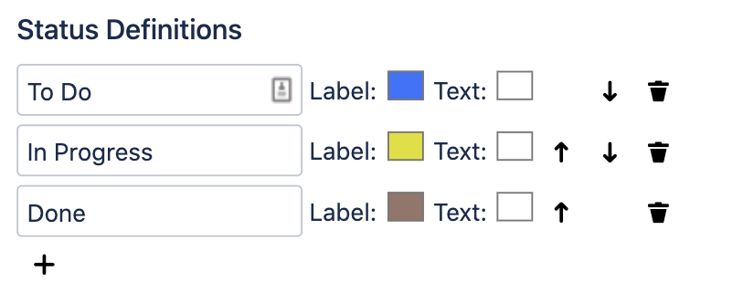
Macro Selections
The macro selections are edited using the Macro Editor Preview panel. In this panel, Status Definitions can be added, removed and resorted.
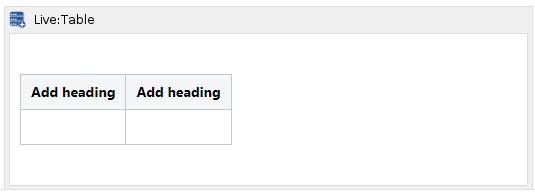
Live:Table
This macro allows users to define a table by specifying its Columns and Headings (which remain static), only then can table rows and row contents can be added, removed and modified live on the page.
Insert the Live Table macro on the page and provide the correct Macro Body contents to get started. The Macro Body contains the raw table data, all live edits are stored in the Macro body when live saves are applied to the table. This is important because it allows users to also edit the table and its contents using the standard Confluence Editor.
At a minimum, the Table Macro body must contain a standard Confluence table with a Heading Row. The Heading Row contents cannot be edited live, so the headings must be edited directly in the Macro body.
Columns can be added or removed at any time by editing the Macro body directly.
Editing Cells
To edit the contents of a cell, simply click in the text area of the cell and start typing. If the cell is empty, the edit box is located at the top-left region of the cell. When changes are made to a cell, either the Add or Save buttons are enabled for you to apply any changes.
Wiki Format
When the table is configured to accept Wiki format, the cell contents should contain untagged text (no xml or html tags) and may also contain Wiki markup, see the Confluence Wiki Markup reference guide.
Some limitations apply, see Limitations section below.
HTML Format
When the table is configured to accept HTML format, the cell contents must contain valid HTML language, and all text should be placed in HTML Tags, such as <p>, <div>, etc… Most HTML Tags are supported, and some obvious tags that are not supported include:
- table (the Live:Table macro does not support nested tables), which also includes table-related tags tr, th, td, thead, tbody, colgroup and col
- script
- style
Some limitations apply, see Limitations section below.
Adding Rows
To add a new row, edit the blank row at the bottom of the table and then hit the Add button. Rows cannot be sorted, nor can they be inserted in this implementation.
Removing Row
To remove a row, click on the Delete button adjacent to the row you want to delete.
Applying Changes
When any of the Add, Save or Delete buttons are clicked, this will save the entire table contents. Therefore you can edit many Rows at once before needed to Apply changes (not recommended, see Warning below). Changes are saved on the Confluence page, in the Macro Body.
Currently, this macro does not handle merge conflicts. If multiple people are editing the text box at the same time, then the last one to Save will overwrite changes from other users.
It is strongly recommended to make small changes and Apply these rather than editing for a long time. Hit Browser Refresh before you start to edit so that you pick up the latest changes.
If a User is modifying any table cell live, and another User makes changes to the page of the table before they Save, then they will see the standard Confluence notification that the Page has been updated. It is strongly recommended in this case to copy the modified table cell (or cells). Reload the page. Merge any text box changes manually (if needed), and continue editing.

Macro Parameters
| Parameter | Required | Description |
|---|---|---|
| Content Format | Optional | This has 2 options: Wiki: The table cells understand Wiki content and will apply a Confluence Wiki renderer to the content for display (Default and typical usage) HTML: The table cells understand HTML and will use an HTML engine to render the content for display (advanced users) |
| Width | Optional | Provide the maximum width of the table, specifying the value in either pixels (px) or percentage (%), default is auto. |
Macro Body
This contains the raw Confluence table and will be updated when users modify the table live.
Users can also modify the Macro Body text in the event that Layout options may not be available during the live edit.
A sample Macro Body will be provided once the Macro is first saved, the Macro Body contents will contain a standard Confluence table like this (default)…
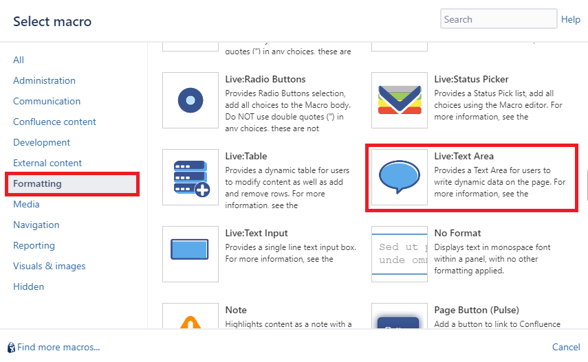
Live:Text Area
This macro provides a text area for users to enter free text and content on the page. This is done live (without editing the Confluence page).
Users click anywhere on the text area, and then they can edit the text. When they want to Save the changes, click on the Save icon below the text box, or click anywhere outside the text area.
Changes are saved on the Confluence page, in the Macro Body.
If the User does not want to save any changes, they can click on the Cancel button below the text area while editing.
Currently, this macro does not handle merge conflicts. If multiple people are editing the text area at the same time, then the last one to Save will overwrite changes from other users.
If a User is modifying the text area live, and another User makes changes to the page of the text area before they Save, then they will see the standard Confluence notification that the Page has been updated. It is strongly recommended in this case to copy the text area contents, using CTLR-C. Reload the page. Merge any text area changes manually (if needed), and continue editing.
Macro Parameters
| Parameter | Required | Description |
|---|---|---|
| Title | Optional | If provided, places input control in a form with the specified Title |
| Title Width | Optional | Specify the width of the Title area in pixels. |
| Placeholder | Optional | Use this to provide a prompt for the user in the input box when the data is empty |
| Content Format | Optional | This has 2 options: Wiki: The text box understands Wiki content and will apply a Confluence Wiki renderer to the content for display (Default and typical usage). For Wiki syntax refer to https://confluence.atlassian.com/doc/confluence-wiki-markup-251003035.html HTML: The text box understands HTML and will use an HTML engine to render the content for display (advanced users). The engine only expects HTML tags that would typically be defined within the <body></body> tags, any attempt to use <script> tags will be ignored. For HTML syntax refer to https://www.w3schools.com/html/html_intro.asp Some limitations apply, see Limitations section below. |
| Width | Optional | Set the width of the Text Area, choices are: Small: 20% Medium: 40% Large: 60% Extra Large: 80% Full Width: 100% of the HTML container (Default) |
| Send Email | Optional | Check this if an email notification is to be sent to Page watches when changed. The default is disabled. |
Macro Body
This contains the text displayed and will be updated when users modify the text box live.
Users can also modify the Macro Body text in the event that Layout options may not be available during the live edit.
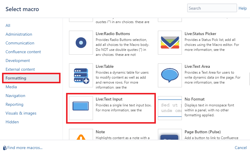
Live:Text Input
This macro displays a Text Input box on the page. Users can enter or modify the contents of the Text Input live (without editing the Confluence page).
Changes are saved when clicking away from the box and changes are stored on the Confluence Server.
Macro Parameters
| Parameter | Required | Description |
|---|---|---|
| Title | Optional | If provided, places input control in a form with the specified Title. |
| Title Width | Optional | Specify the width of the Title area in pixels. |
| Red outline when empty | Optional | Add a red outline to the input when the field is empty. |
| Placeholder | Optional | Use this to provide a prompt for the user in the input box when the data is empty |
| Width | Optional | Sets the width of the Input box, choices are: * Small * Medium * Large * Extra Large * Full Width The default is Medium. |
| Max Text Length | Optional | This specifies the maximum number of characters that can be entered into the box. The default length is 100. |
| Validation Pattern | Optional | A Regular Expression, when provided, will be used to validate the user input. If a pattern is provided, and it is a valid regex, and the input does not match the pattern, then the data will not be saved and a message will be displayed for the user. |
| Page Variable | Optional | Use this to add Page Variables, when added, then the variable substitution will be carried out on the page. Use %PageVariable anywhere on the page to substitute the selected value. Use Page Variables for programming using remote API access and JavaScript access. Refer to Page Variable Substitution |
| Send Email | Optional | Check this if an email notification is to be sent to Page watches when changed. The default is disabled. |
| Don’t Save | Optional | If set then data is not stored on the server. Useful when creating interactive forms or automation. The default behavior is to save changes. |
Macro Body
This contains the text displayed and will be updated when users modify the text live.
Limitations
The following limitation applies when using the Live Input Macros application.
- A maximum of 1000 Live macros can be inserted on a single page. When this number is exceeded, performance issues and page loads are affected and pages may fail to load.
- For Live:Table and Live:TextArea macros, interactive elements are not supported, this includes links, form elements or any other controls that expect mouse clicks to change the behaviour of the content or page.
Programming Interfaces
To see how Live Input Macros can be used for automation tasks and advanced programming, refer to Programming Interfaces
 KC Integrations