User’s Guide
There are 3 macros available, these provide slightly different capabilities…
Page Button (Pulse)
This button provides a link to any Confluence content, Page or Blog Post. It can be configured to animate itself when the target page has new content that has not been viewed by the current user.
This feature uses the Recently Viewed content database, which is restricted to 60 days only, therefore this feature only animates when the modified content is between 0 and 60 days in the past.
Look for this macro in the Macro Browser

Macro Parameters
| Parameter | Description |
|---|---|
| Page/Blog Post | (Required) The name (or contentid) of the Page or Blog Post to launch when the button is clicked. |
| Title | (Optional) If provided, this will be used as the text on the button, if left blank, the the content Title will be used. |
| Update Check | (Optional) Select whether to check for modified content. If the content has been modified since the user last viewed the content, then the button will pulse (animate) to indicate that there is new information on the page that has not been seen. Options are: Do Not Check – Don’t check for modifications, the button will never pulse. This is the default Page Only – Only check for modifications on the linked page Page and Children – Check for modifications on the linked page and its immediate children Page and all Descendants – Check for modifications on the linked page and the descendants treeNOTE: This feature uses the internal Confluence database Recent Viewed data, which only contains views for 60 days. Therefore any modifications outside this 60 day windows will not be highlighted to the user. |
| Width | (Optional) Specify the width of the button, if left blank, then “auto” is applied. Any valid css width style can be used, examples: “100px”, “2cm”, “50%” |
| Button Colour | (Optional) Provide the colour to be applied to the button. if left blank, then a deep blue is used. Any valid css colour style can be used, examples: “#FFFFFF”, “rgb(FF,FF,FF)”, “white” |
| Text Colour | (Optional) Provide the colour to be applied to the text. if left blank, then white is used. Any valid css colour style can be used, examples: “#FFFFFF”, “rgb(FF,FF,FF)”, “white” |
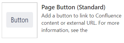
Page Button (Standard)
This Button provides links to either Confluence content or any external URL, using the standard Confluence UI graphical button so that it looks just like a standard Confluence element.
The button can be configured to use the page title, or overridden with any name. The title can even be blank when used with Icons. An Icon can be added to the button, using the integrated Confluence Icon set. To see all the available Icons, refer to the AUI Icon library.
Look for this macro in the Macro Browser
Macro Parameters
| Parameter | Description |
|---|---|
| Page/Blog Post | (Optional) The name (or contentid) of the Page or Blog Post to launch when the button is clicked. |
| External URL | (Optional) The URL to launch when the button is clicked. If both Page/Blog Post and URL parameters are provided, then the URL will be ignored. |
| Title | (Optional) This is the text to appear on the button, if left blank then the text will be blank, or can be overridden with the content title if the checkbox below is enabled. |
| Use Confluence Content Title | (Optional) Checkbox to override the title with the Page/Blog Post title |
| Button Style | (Optional) Choose from one of the built-in Confluence button styles: Standard – Standard button, light grey and dark grey text, this is the default Primary – A blue button with white text Link – Does not render a button and uses simple link instead Subtle – Does not show the button until mouse hovers over the text Compact – Small footprint button is used |
| Width | (Optional) Specify the width of the button, if left blank, then “auto” is applied. Any valid css width style can be used, examples: “100px”, “2cm”, “50%” |
| Height | (Optional) Specify the height of the button, if left blank, then “auto” is applied. Any valid css height style can be used, examples: “100px”, “2cm”, “50%” |
| Button Colour | (Optional) Provide the colour to be applied to the button. if left blank, then the Confluence default is used. Any valid css colour style can be used, examples: “#FFFFFF”, “rgb(FF,FF,FF)”, “white” |
| Text Colour | (Optional) Provide the colour to be applied to the text. if left blank, then the Confluence default is used. Any valid css colour style can be used, examples: “#FFFFFF”, “rgb(FF,FF,FF)”, “white” |
| Icon Name | (Optional) An icon can be added to the button, if left blank then no icon is used. The name provided must be one of the Confluence icons available, these are provided here. To get the icon name, hover over the icon and use the pop-up name shown. Examples: “settings”, “search”, “like”. If an invalid name is used, the icon will not be displayed. |
Popup Button
This button, which can be configured as link text, when activated will show a pop-up window showing the contents of the Macro body. This behaviour is similar to Tool Tips, which can be used to provide short on page help text when needed.
When the Pop-up Dialog is visible, it can be closed by either, pressing the ESC key, clicking away from the popup dialog or if shown, click the ‘Close’ link.
Look for this macro in the Macro Browser

Macro Parameters
| Parameter | Description |
|---|---|
| Window | Choose whether the pop-up window dialog uses a Windowed or Inline dialog. |
| Title | (Required) This is the text to appear on the button or hyper-link. |
| Button Style | (Optional) Choose from one of the built-in Confluence button styles: Standard – Standard button, light grey and dark grey text, this is the default Primary – A blue button with white text Link – Does not render a button and uses simple link instead Subtle – Does not show the button until mouse hovers over the text Compact – Small footprint button is used |
| Width | (Optional) Specify the width of the button, if left blank, then “auto” is applied. Any valid css width style can be used, examples: “100px”, “2cm”, “50%” |
| Height | (Optional) Specify the height of the button, if left blank, then “auto” is applied. Any valid css height style can be used, examples: “100px”, “2cm”, “50%” |
| Button Colour | (Optional) Provide the colour to be applied to the button. if left blank, then the Confluence default is used. Any valid css colour style can be used, examples: “#FFFFFF”, “rgb(FF,FF,FF)”, “white” |
| Text Colour | (Optional) Provide the colour to be applied to the text. if left blank, then the Confluence default is used. Any valid css colour style can be used, examples: “#FFFFFF”, “rgb(FF,FF,FF)”, “white” |
| Icon Name | (Optional) An icon can be added to the button, if left blank then no icon is used. The name provided must be one of the Confluence icons available, these are provided here. To get the icon name, hover over the icon and use the pop-up name shown. Examples: “settings”, “search”, “like”. If an invalid name is used, the icon will not be displayed. |
Macro Body
The Macro body is Rich Text content, so most editor features can be used. The content in the Macro body will be displayed when the button is activated.
 KC Integrations